
|
| Candy Color Button Animation |
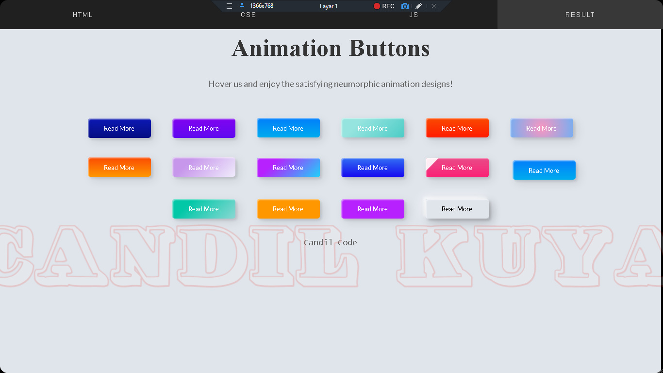
Candil.eu.org. - Hallo Programmer kembali lagi di blog saya yang sangat sederhana ini, hari ini kita akan belajar web design mebuat tampilan Candy Color Button Animation, sebuah tutorial pemrograman dasar hanya menggunakan CSS dan HTML yang bisa dijadikan refferensi pembelajaran untuk anda para pengunjung setia blog dan juga youtube channel Candil Code, Silahkan di simak dan perhatikan baik-baik code HTML, CSS Tanpa Javascript yang sudah saya sediakan di bawah ini.
SUbJuadul Postingan
<header>
   <link href="https://fonts.googleapis.com/css2?family=Lato&display=swap" rel="stylesheet">
</header>

<h1>Animation Buttons</h1>
<p>Hover us and enjoy the satisfying neumorphic animation designs!</p>
<div class="frame">
  <button class="custom-btn btn-1">Read More</button>
  <button class="custom-btn btn-2">Read More</button>
  <button class="custom-btn btn-3"><span>Read More</span></button>
  <button class="custom-btn btn-4"><span>Read More</span></button>
  <button class="custom-btn btn-5"><span>Read More</span></button>
  <button class="custom-btn btn-6"><span>Read More</span></button>
  <button class="custom-btn btn-7"><span>Read More</span></button>
  <button class="custom-btn btn-8"><span>Read More</span></button>
  <button class="custom-btn btn-9">Read More</button>
  <button class="custom-btn btn-10">Read More</button>
  <button class="custom-btn btn-11">Read More<div class="dot"></div></button>
  <button class="custom-btn btn-12"><span>Click!</span><span>Read More</span></button>
  <button class="custom-btn btn-13">Read More</button>
  <button class="custom-btn btn-14">Read More</button>
  <button class="custom-btn btn-15">Read More</button>
  <button class="custom-btn btn-16">Read More</button>
  <p style="font-family: Andale Mono, monospace;">
    Candil Code</p>
</div>
body {
  background: #e0e5ec;
}
h1 {
  position: relative;
  text-align: center;
  color: #353535;
  font-size: 50px;
  font-family: "Cormorant Garamond", serif;
}

p {
  font-family: 'Lato', sans-serif;
  font-weight: 300;
  text-align: center;
  font-size: 18px;
  color: #676767;
}
.frame {
  width: 90%;
  margin: 40px auto;
  text-align: center;
}
button {
  margin: 20px;
}
.custom-btn {
  width: 130px;
  height: 40px;
  color: #fff;
  border-radius: 5px;
  padding: 10px 25px;
  font-family: 'Lato', sans-serif;
  font-weight: 500;
  background: transparent;
  cursor: pointer;
  transition: all 0.3s ease;
  position: relative;
  display: inline-block;
   box-shadow:inset 2px 2px 2px 0px rgba(255,255,255,.5),
   7px 7px 20px 0px rgba(0,0,0,.1),
   4px 4px 5px 0px rgba(0,0,0,.1);
  outline: none;
}

/* 1 */
.btn-1 {
  background: rgb(6,14,131);
  background: linear-gradient(0deg, rgba(6,14,131,1) 0%, rgba(12,25,180,1) 100%);
  border: none;
}
.btn-1:hover {
   background: rgb(0,3,255);
background: linear-gradient(0deg, rgba(0,3,255,1) 0%, rgba(2,126,251,1) 100%);
}

/* 2 */
.btn-2 {
  background: rgb(96,9,240);
  background: linear-gradient(0deg, rgba(96,9,240,1) 0%, rgba(129,5,240,1) 100%);
  border: none;

}
.btn-2:before {
  height: 0%;
  width: 2px;
}
.btn-2:hover {
  box-shadow:  4px 4px 6px 0 rgba(255,255,255,.5),
              -4px -4px 6px 0 rgba(116, 125, 136, .5),
    inset -4px -4px 6px 0 rgba(255,255,255,.2),
    inset 4px 4px 6px 0 rgba(0, 0, 0, .4);
}


/* 3 */
.btn-3 {
  background: rgb(0,172,238);
background: linear-gradient(0deg, rgba(0,172,238,1) 0%, rgba(2,126,251,1) 100%);
  width: 130px;
  height: 40px;
  line-height: 42px;
  padding: 0;
  border: none;

}
.btn-3 span {
  position: relative;
  display: block;
  width: 100%;
  height: 100%;
}
.btn-3:before,
.btn-3:after {
  position: absolute;
  content: "";
  right: 0;
  top: 0;
   background: rgba(2,126,251,1);
  transition: all 0.3s ease;
}
.btn-3:before {
  height: 0%;
  width: 2px;
}
.btn-3:after {
  width: 0%;
  height: 2px;
}
.btn-3:hover{
   background: transparent;
  box-shadow: none;
}
.btn-3:hover:before {
  height: 100%;
}
.btn-3:hover:after {
  width: 100%;
}
.btn-3 span:hover{
   color: rgba(2,126,251,1);
}
.btn-3 span:before,
.btn-3 span:after {
  position: absolute;
  content: "";
  left: 0;
  bottom: 0;
   background: rgba(2,126,251,1);
  transition: all 0.3s ease;
}
.btn-3 span:before {
  width: 2px;
  height: 0%;
}
.btn-3 span:after {
  width: 0%;
  height: 2px;
}
.btn-3 span:hover:before {
  height: 100%;
}
.btn-3 span:hover:after {
  width: 100%;
}

/* 4 */
.btn-4 {
  background-color: #4dccc6;
background-image: linear-gradient(315deg, #4dccc6 0%, #96e4df 74%);
  line-height: 42px;
  padding: 0;
  border: none;
}
.btn-4:hover{
  background-color: #89d8d3;
background-image: linear-gradient(315deg, #89d8d3 0%, #03c8a8 74%);
}
.btn-4 span {
  position: relative;
  display: block;
  width: 100%;
  height: 100%;
}
.btn-4:before,
.btn-4:after {
  position: absolute;
  content: "";
  right: 0;
  top: 0;
   box-shadow:  4px 4px 6px 0 rgba(255,255,255,.9),
              -4px -4px 6px 0 rgba(116, 125, 136, .2),
    inset -4px -4px 6px 0 rgba(255,255,255,.9),
    inset 4px 4px 6px 0 rgba(116, 125, 136, .3);
  transition: all 0.3s ease;
}
.btn-4:before {
  height: 0%;
  width: .1px;
}
.btn-4:after {
  width: 0%;
  height: .1px;
}
.btn-4:hover:before {
  height: 100%;
}
.btn-4:hover:after {
  width: 100%;
}
.btn-4 span:before,
.btn-4 span:after {
  position: absolute;
  content: "";
  left: 0;
  bottom: 0;
  box-shadow:  4px 4px 6px 0 rgba(255,255,255,.9),
              -4px -4px 6px 0 rgba(116, 125, 136, .2),
    inset -4px -4px 6px 0 rgba(255,255,255,.9),
    inset 4px 4px 6px 0 rgba(116, 125, 136, .3);
  transition: all 0.3s ease;
}
.btn-4 span:before {
  width: .1px;
  height: 0%;
}
.btn-4 span:after {
  width: 0%;
  height: .1px;
}
.btn-4 span:hover:before {
  height: 100%;
}
.btn-4 span:hover:after {
  width: 100%;
}

/* 5 */
.btn-5 {
  width: 130px;
  height: 40px;
  line-height: 42px;
  padding: 0;
  border: none;
  background: rgb(255,27,0);
background: linear-gradient(0deg, rgba(255,27,0,1) 0%, rgba(251,75,2,1) 100%);
}
.btn-5:hover {
  color: #f0094a;
  background: transparent;
   box-shadow:none;
}
.btn-5:before,
.btn-5:after{
  content:'';
  position:absolute;
  top:0;
  right:0;
  height:2px;
  width:0;
  background: #f0094a;
  box-shadow:
   -1px -1px 5px 0px #fff,
   7px 7px 20px 0px #0003,
   4px 4px 5px 0px #0002;
  transition:400ms ease all;
}
.btn-5:after{
  right:inherit;
  top:inherit;
  left:0;
  bottom:0;
}
.btn-5:hover:before,
.btn-5:hover:after{
  width:100%;
  transition:800ms ease all;
}


/* 6 */
.btn-6 {
  background: rgb(247,150,192);
background: radial-gradient(circle, rgba(247,150,192,1) 0%, rgba(118,174,241,1) 100%);
  line-height: 42px;
  padding: 0;
  border: none;
}
.btn-6 span {
  position: relative;
  display: block;
  width: 100%;
  height: 100%;
}
.btn-6:before,
.btn-6:after {
  position: absolute;
  content: "";
  height: 0%;
  width: 1px;
 box-shadow:
   -1px -1px 20px 0px rgba(255,255,255,1),
   -4px -4px 5px 0px rgba(255,255,255,1),
   7px 7px 20px 0px rgba(0,0,0,.4),
   4px 4px 5px 0px rgba(0,0,0,.3);
}
.btn-6:before {
  right: 0;
  top: 0;
  transition: all 500ms ease;
}
.btn-6:after {
  left: 0;
  bottom: 0;
  transition: all 500ms ease;
}
.btn-6:hover{
  background: transparent;
  color: #76aef1;
  box-shadow: none;
}
.btn-6:hover:before {
  transition: all 500ms ease;
  height: 100%;
}
.btn-6:hover:after {
  transition: all 500ms ease;
  height: 100%;
}
.btn-6 span:before,
.btn-6 span:after {
  position: absolute;
  content: "";
  box-shadow:
   -1px -1px 20px 0px rgba(255,255,255,1),
   -4px -4px 5px 0px rgba(255,255,255,1),
   7px 7px 20px 0px rgba(0,0,0,.4),
   4px 4px 5px 0px rgba(0,0,0,.3);
}
.btn-6 span:before {
  left: 0;
  top: 0;
  width: 0%;
  height: .5px;
  transition: all 500ms ease;
}
.btn-6 span:after {
  right: 0;
  bottom: 0;
  width: 0%;
  height: .5px;
  transition: all 500ms ease;
}
.btn-6 span:hover:before {
  width: 100%;
}
.btn-6 span:hover:after {
  width: 100%;
}

/* 7 */
.btn-7 {
background: linear-gradient(0deg, rgba(255,151,0,1) 0%, rgba(251,75,2,1) 100%);
  line-height: 42px;
  padding: 0;
  border: none;
}
.btn-7 span {
  position: relative;
  display: block;
  width: 100%;
  height: 100%;
}
.btn-7:before,
.btn-7:after {
  position: absolute;
  content: "";
  right: 0;
  bottom: 0;
  background: rgba(251,75,2,1);
  box-shadow:
   -7px -7px 20px 0px rgba(255,255,255,.9),
   -4px -4px 5px 0px rgba(255,255,255,.9),
   7px 7px 20px 0px rgba(0,0,0,.2),
   4px 4px 5px 0px rgba(0,0,0,.3);
  transition: all 0.3s ease;
}
.btn-7:before{
   height: 0%;
   width: 2px;
}
.btn-7:after {
  width: 0%;
  height: 2px;
}
.btn-7:hover{
  color: rgba(251,75,2,1);
  background: transparent;
}
.btn-7:hover:before {
  height: 100%;
}
.btn-7:hover:after {
  width: 100%;
}
.btn-7 span:before,
.btn-7 span:after {
  position: absolute;
  content: "";
  left: 0;
  top: 0;
  background: rgba(251,75,2,1);
  box-shadow:
   -7px -7px 20px 0px rgba(255,255,255,.9),
   -4px -4px 5px 0px rgba(255,255,255,.9),
   7px 7px 20px 0px rgba(0,0,0,.2),
   4px 4px 5px 0px rgba(0,0,0,.3);
  transition: all 0.3s ease;
}
.btn-7 span:before {
  width: 2px;
  height: 0%;
}
.btn-7 span:after {
  height: 2px;
  width: 0%;
}
.btn-7 span:hover:before {
  height: 100%;
}
.btn-7 span:hover:after {
  width: 100%;
}

/* 8 */
.btn-8 {
  background-color: #f0ecfc;
background-image: linear-gradient(315deg, #f0ecfc 0%, #c797eb 74%);
  line-height: 42px;
  padding: 0;
  border: none;
}
.btn-8 span {
  position: relative;
  display: block;
  width: 100%;
  height: 100%;
}
.btn-8:before,
.btn-8:after {
  position: absolute;
  content: "";
  right: 0;
  bottom: 0;
  background: #c797eb;
  /*box-shadow:  4px 4px 6px 0 rgba(255,255,255,.5),
              -4px -4px 6px 0 rgba(116, 125, 136, .2),
    inset -4px -4px 6px 0 rgba(255,255,255,.5),
    inset 4px 4px 6px 0 rgba(116, 125, 136, .3);*/
  transition: all 0.3s ease;
}
.btn-8:before{
   height: 0%;
   width: 2px;
}
.btn-8:after {
  width: 0%;
  height: 2px;
}
.btn-8:hover:before {
  height: 100%;
}
.btn-8:hover:after {
  width: 100%;
}
.btn-8:hover{
  background: transparent;
}
.btn-8 span:hover{
  color: #c797eb;
}
.btn-8 span:before,
.btn-8 span:after {
  position: absolute;
  content: "";
  left: 0;
  top: 0;
  background: #c797eb;
  /*box-shadow:  4px 4px 6px 0 rgba(255,255,255,.5),
              -4px -4px 6px 0 rgba(116, 125, 136, .2),
    inset -4px -4px 6px 0 rgba(255,255,255,.5),
    inset 4px 4px 6px 0 rgba(116, 125, 136, .3);*/
  transition: all 0.3s ease;
}
.btn-8 span:before {
  width: 2px;
  height: 0%;
}
.btn-8 span:after {
  height: 2px;
  width: 0%;
}
.btn-8 span:hover:before {
  height: 100%;
}
.btn-8 span:hover:after {
  width: 100%;
}


/* 9 */
.btn-9 {
  border: none;
  transition: all 0.3s ease;
  overflow: hidden;
}
.btn-9:after {
  position: absolute;
  content: " ";
  z-index: -1;
  top: 0;
  left: 0;
  width: 100%;
  height: 100%;
   background-color: #1fd1f9;
background-image: linear-gradient(315deg, #1fd1f9 0%, #b621fe 74%);
  transition: all 0.3s ease;
}
.btn-9:hover {
  background: transparent;
  box-shadow:  4px 4px 6px 0 rgba(255,255,255,.5),
              -4px -4px 6px 0 rgba(116, 125, 136, .2),
    inset -4px -4px 6px 0 rgba(255,255,255,.5),
    inset 4px 4px 6px 0 rgba(116, 125, 136, .3);
  color: #fff;
}
.btn-9:hover:after {
  -webkit-transform: scale(2) rotate(180deg);
  transform: scale(2) rotate(180deg);
  box-shadow:  4px 4px 6px 0 rgba(255,255,255,.5),
              -4px -4px 6px 0 rgba(116, 125, 136, .2),
    inset -4px -4px 6px 0 rgba(255,255,255,.5),
    inset 4px 4px 6px 0 rgba(116, 125, 136, .3);
}

/* 10 */
.btn-10 {
  background: rgb(22,9,240);
background: linear-gradient(0deg, rgba(22,9,240,1) 0%, rgba(49,110,244,1) 100%);
  color: #fff;
  border: none;
  transition: all 0.3s ease;
  overflow: hidden;
}
.btn-10:after {
  position: absolute;
  content: " ";
  top: 0;
  left: 0;
  z-index: -1;
  width: 100%;
  height: 100%;
  transition: all 0.3s ease;
  -webkit-transform: scale(.1);
  transform: scale(.1);
}
.btn-10:hover {
  color: #fff;
  border: none;
  background: transparent;
}
.btn-10:hover:after {
  background: rgb(0,3,255);
background: linear-gradient(0deg, rgba(2,126,251,1) 0%,  rgba(0,3,255,1)100%);
  -webkit-transform: scale(1);
  transform: scale(1);
}

/* 11 */
.btn-11 {
  border: none;
  background: rgb(251,33,117);
    background: linear-gradient(0deg, rgba(251,33,117,1) 0%, rgba(234,76,137,1) 100%);
    color: #fff;
    overflow: hidden;
}
.btn-11:hover {
    text-decoration: none;
    color: #fff;
}
.btn-11:before {
    position: absolute;
    content: '';
    display: inline-block;
    top: -180px;
    left: 0;
    width: 30px;
    height: 100%;
    background-color: #fff;
    animation: shiny-btn1 3s ease-in-out infinite;
}
.btn-11:hover{
  opacity: .7;
}
.btn-11:active{
  box-shadow:  4px 4px 6px 0 rgba(255,255,255,.3),
              -4px -4px 6px 0 rgba(116, 125, 136, .2),
    inset -4px -4px 6px 0 rgba(255,255,255,.2),
    inset 4px 4px 6px 0 rgba(0, 0, 0, .2);
}


@-webkit-keyframes shiny-btn1 {
    0% { -webkit-transform: scale(0) rotate(45deg); opacity: 0; }
    80% { -webkit-transform: scale(0) rotate(45deg); opacity: 0.5; }
    81% { -webkit-transform: scale(4) rotate(45deg); opacity: 1; }
    100% { -webkit-transform: scale(50) rotate(45deg); opacity: 0; }
}


/* 12 */
.btn-12{
  position: relative;
  right: 20px;
  bottom: 20px;
  border:none;
  box-shadow: none;
  width: 130px;
  height: 40px;
  line-height: 42px;
  -webkit-perspective: 230px;
  perspective: 230px;
}
.btn-12 span {
  background: rgb(0,172,238);
background: linear-gradient(0deg, rgba(0,172,238,1) 0%, rgba(2,126,251,1) 100%);
  display: block;
  position: absolute;
  width: 130px;
  height: 40px;
  box-shadow:inset 2px 2px 2px 0px rgba(255,255,255,.5),
   7px 7px 20px 0px rgba(0,0,0,.1),
   4px 4px 5px 0px rgba(0,0,0,.1);
  border-radius: 5px;
  margin:0;
  text-align: center;
  -webkit-box-sizing: border-box;
  -moz-box-sizing: border-box;
  box-sizing: border-box;
  -webkit-transition: all .3s;
  transition: all .3s;
}
.btn-12 span:nth-child(1) {
  box-shadow:
   -7px -7px 20px 0px #fff9,
   -4px -4px 5px 0px #fff9,
   7px 7px 20px 0px #0002,
   4px 4px 5px 0px #0001;
  -webkit-transform: rotateX(90deg);
  -moz-transform: rotateX(90deg);
  transform: rotateX(90deg);
  -webkit-transform-origin: 50% 50% -20px;
  -moz-transform-origin: 50% 50% -20px;
  transform-origin: 50% 50% -20px;
}
.btn-12 span:nth-child(2) {
  -webkit-transform: rotateX(0deg);
  -moz-transform: rotateX(0deg);
  transform: rotateX(0deg);
  -webkit-transform-origin: 50% 50% -20px;
  -moz-transform-origin: 50% 50% -20px;
  transform-origin: 50% 50% -20px;
}
.btn-12:hover span:nth-child(1) {
  box-shadow:inset 2px 2px 2px 0px rgba(255,255,255,.5),
   7px 7px 20px 0px rgba(0,0,0,.1),
   4px 4px 5px 0px rgba(0,0,0,.1);
  -webkit-transform: rotateX(0deg);
  -moz-transform: rotateX(0deg);
  transform: rotateX(0deg);
}
.btn-12:hover span:nth-child(2) {
  box-shadow:inset 2px 2px 2px 0px rgba(255,255,255,.5),
   7px 7px 20px 0px rgba(0,0,0,.1),
   4px 4px 5px 0px rgba(0,0,0,.1);
 color: transparent;
  -webkit-transform: rotateX(-90deg);
  -moz-transform: rotateX(-90deg);
  transform: rotateX(-90deg);
}


/* 13 */
.btn-13 {
  background-color: #89d8d3;
background-image: linear-gradient(315deg, #89d8d3 0%, #03c8a8 74%);
  border: none;
  z-index: 1;
}
.btn-13:after {
  position: absolute;
  content: "";
  width: 100%;
  height: 0;
  bottom: 0;
  left: 0;
  z-index: -1;
  border-radius: 5px;
   background-color: #4dccc6;
background-image: linear-gradient(315deg, #4dccc6 0%, #96e4df 74%);
  box-shadow:
   -7px -7px 20px 0px #fff9,
   -4px -4px 5px 0px #fff9,
   7px 7px 20px 0px #0002,
   4px 4px 5px 0px #0001;
  transition: all 0.3s ease;
}
.btn-13:hover {
  color: #fff;
}
.btn-13:hover:after {
  top: 0;
  height: 100%;
}
.btn-13:active {
  top: 2px;
}


/* 14 */
.btn-14 {
  background: rgb(255,151,0);
  border: none;
  z-index: 1;
}
.btn-14:after {
  position: absolute;
  content: "";
  width: 100%;
  height: 0;
  top: 0;
  left: 0;
  z-index: -1;
  border-radius: 5px;
  background-color: #eaf818;
  background-image: linear-gradient(315deg, #eaf818 0%, #f6fc9c 74%);
   box-shadow:inset 2px 2px 2px 0px rgba(255,255,255,.5);
   7px 7px 20px 0px rgba(0,0,0,.1),
   4px 4px 5px 0px rgba(0,0,0,.1);
  transition: all 0.3s ease;
}
.btn-14:hover {
  color: #000;
}
.btn-14:hover:after {
  top: auto;
  bottom: 0;
  height: 100%;
}
.btn-14:active {
  top: 2px;
}

/* 15 */
.btn-15 {
  background: #b621fe;
  border: none;
  z-index: 1;
}
.btn-15:after {
  position: absolute;
  content: "";
  width: 0;
  height: 100%;
  top: 0;
  right: 0;
  z-index: -1;
  background-color: #663dff;
  border-radius: 5px;
   box-shadow:inset 2px 2px 2px 0px rgba(255,255,255,.5),
   7px 7px 20px 0px rgba(0,0,0,.1),
   4px 4px 5px 0px rgba(0,0,0,.1);
  transition: all 0.3s ease;
}
.btn-15:hover {
  color: #fff;
}
.btn-15:hover:after {
  left: 0;
  width: 100%;
}
.btn-15:active {
  top: 2px;
}


/* 16 */
.btn-16 {
  border: none;
  color: #000;
}
.btn-16:after {
  position: absolute;
  content: "";
  width: 0;
  height: 100%;
  top: 0;
  left: 0;
  direction: rtl;
  z-index: -1;
  box-shadow:
   -7px -7px 20px 0px #fff9,
   -4px -4px 5px 0px #fff9,
   7px 7px 20px 0px #0002,
   4px 4px 5px 0px #0001;
  transition: all 0.3s ease;
}
.btn-16:hover {
  color: #000;
}
.btn-16:hover:after {
  left: auto;
  right: 0;
  width: 100%;
}
.btn-16:active {
  top: 2px;
}
Your_code_is_here
Demo code Candy Color Button Animation
Saya membagikan code ini hanya untuk tujuan pengujian dan pembelajaran. Jika dirasa Artikel Yang saya tulis melanggar Hak Cipta Silahkan kirimkan pesan kepada Saya Melalui Halaman Kontak dan Saya akan menghapusnya sesegera mungkin.
Untuk para pengunjung Blog yang saat ini sedang mencari layanan jasa pembuatan website, anda bisa kunjungi Jasa Candil Kuya di google.
Penutup
Bagaimana sobat Candil cukup mudah bukan? blog ini sengaja saya sediakan khusus untuk anda yang masih pemula di dalam dunia pemrograman, Semoga dapat bermanfaat bagi sobat Candil yang ingin belajar dasar pemrograman seperti HTML, CSS dan Juga Javascript.
Jangan lupa share dan jika ada kekurangan serta koreksi di dalam penulisan code Candy Color Button Animation silahkan tulis melalui kolom komentar di bawah ini ya. Terima kasih!
Autor:
www.candil.eu.org


